Monday, July 14, 2008
RIP T-shirts
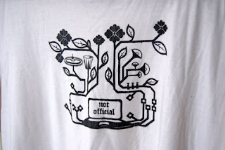
It is a sad time in a mans life when the nagging of his girlfriend finally overcomes his tolerance and he gives in to the whims of a mad woman, and thus rids himself of his old friends the T-shirts. She has a point though, they are worn, stained and a bit crummy looking, but having printed them myself I can't help but feel a pang of sorrow as I usher them into the afterlife. Alas there are more to follow also.
Design and Art Direction 2008 New Blood exhibition
Every year Universities from a round the country gather together in Earls court. Its an opportunity to show case up and coming talent, but mainly an excuse to check out the competition and pick up free postcards.
Two pieces of my work were selected to contribute to the Bath Spa University stand; a poster from a collection of four entitled 'A collection of words' bright proverb based hand drawn text posters, and a design research book that dealt with symbols within graphic design.
During the three day exhibition a panel of professionals view the work on show and discuss the work. They also go so far as offering awards for 'Best new Blood'. My poster was fortunate enough to be chosen (along with Wayne Smith from Bath Spa- great typographer) fro one of these awards. About 30 students were chosen out of thousands of examples of work, so I feel quite privileged to be amongst the few. As a winner we are awarded free membership to the DandAd for a year, entrance into the talent pool show case of work, and the benefit of their graduate placement scheme. Thank you DandAd!
Check here for the other winners:
http://www.creativereview.co.uk/crblog/degree-shows-08-dad-new-blood-2/
Friday, June 27, 2008
Au revoir
Well University is over now. My three years have been swifter than swift, and already it is time to pack up and go. I like to think I have spent my time wisely and used the opportunities that were available. I took one last walk around today, taking in the grounds, studios and buildings. The lecturers here have been supportive and invaluable throughout my education, I have been pushed, pulled and directed in many new and interesting directions, and for that I am grateful. Good bye University and Good Luck everyone.
Act/ Refract/ Degree show
As the final part of my Graphic Communication BA we were are asked to produce a piece of work for our end of year show. This year it was loosely themed around the word 'act', we could chose any word provided act was within it i.e. impact, action, distract etc. I chose the word 'refract'. Refraction is the bending of energy waves when they pass through objects of different mass, an example is a straw in a glass of water looks distorted below the water line- this is refraction. I chose refraction as I believe it can be used as a metaphor for graphic communication. Each designer and illustrator is a medium for ideas, concepts, images and text, and each person will have an individual way of composing, arranging and producing a piece of work. refraction is a filtering process, it changes the appearance of things and gives us a new perspective, so is graphic communication.
I produced a large (110cm/ 70cm) wooden 3D poster, onto this I painted a collection of water droplet shapes in primary and secondary colours. the nature of the wooden surface means that each droplet is broken and misshapen when viewed face on. However if you find the right position you can view each one as a perfect shape. This reinforces the concept of perspective and interpretation. For the degree show I also produce an A1 7 colour silk screen poster of my Refract design.
JETBALLZ
In the wind up to our degree show there was naturally an overriding sense of tension and anxiety in the air. In fact the air was often blue and peoples faces dark. It was a time of deep thought and professional and future directed contemplation. People were pissed off. During my weekly shop at Morrisons I came across an unlikely antidote in the form of 12 for 99p Jetballs. They're cheap, they break after a while, they leave an odd oily residue in your hand, but they bounce in an unearthly fashion. After dribbling mine around Uni I noticed the appreciative longing looks and decided to share the wealth. I drew a poster and made a little nest for the Jetballs, they disappeared pretty sharpish. All the kids were bouncing in the halls, jealously guarding their balls, and trying out eXtreme bouncing outside. You could almost forget about the impending deadlines and mortality of our degree. Sadly Morrisons are out of stock and now I am left with none.
KarlssonWilker
As part of my professional context module we were asked to produce a piece of work in relation to a professional practitioner(s). For a while now I have been a big fan of KarlssonWilker based in NY. Jan Wilker and Hjalti Karlsson are former students of Sagmeister, they set out together to form their own studio in 2000. There book 'Tellmewhy' chronicles their first 24 months as a design studio, its is a frank, humorous and compelling read and a departure from your usual design text, it marks the highest highs and the embarrassing lows. Their work is clean, innovative and sometimes a funny too.
I designed a poster that features individual mini biographies of Jan and Hjalti as well as KarlssonWilker, it documents a wide selection of their work with descriptions and annotations, it also states my reasons for choosing their design practice and my impression of their work. The poster folds from over 1m tall into a neat little rectangle, I've tried to adopt a light KarlssonWilker sense of humor with captions and instruction.
Check their work out here.
Subscribe to:
Posts (Atom)